Beauty at the Cost of Insight
This entry was written by Bryan Pierce of Perceptual Edge.
Recently, I found a glowing press release from a business intelligence vendor named Blink Logic, which announced that their software is now being used by a large financial services company. After reading the press release, I went to their website where I found the following image:
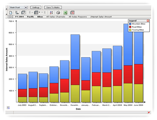
This is a stacked bar graph that is being used to display how Internet Sales have changed from month to month. Each stacked bar combines sales for Mountain Bikes, Road Bikes, and Touring Bikes. Although this might not be the best graph for the job (notice how difficult it is to compare the heights of the red or blue bars), depending on what their client needs to focus on, this graph type might be sufficient.
What bothered me and prompted me to write about this graph appears in the legend in the upper right corner.
